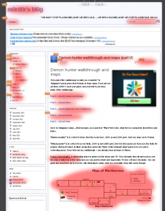
The term is quite old and is quite self-explanatory. If you have a look at the picture on your right, you will see some areas in red, that are actually taking the visitor’s attention first and/or gets clicked while the others are not even looked upon. (I’ve hidden and pixellated the actual ADs and the Google Analytics result, so I don’t break Google TOS, but you can get your own by simply applying to the program.)
This is called Banner blindness.
It happens often to sites, that use AdSense or other AD programs to see some decline in revenues, even if the visitor numbers grow. For what is important in sites that give away free information, walk-through, how to’s and other important stuff is … to generate some revenue from ADs.
In present days, the attention on a page in the internet is … 10 seconds. To write an article that can take a visitor to actually read it, you need some talent to write or some ability to help the others. So if you are one of the common present-day breed that wants to make money online by blogging and writing articles – you probably already know what I mean.
To write an interesting article is the hardest part. Then you get some higher paying keywords inside; sit back and wait for the readers to come and read.
That’s not enough though. You want to sell your article and/or generate passive monthly income from it. The common Click-through rate (CTR) according to Wikipedia is 0.3% (on 1000 visitors ~3 will click ADs). You want more, and that’s why you need a way to make the visitor
Lose Banner Blindness
at least as long as he reads your article.
There are few methods that can help you in this.
1. Fusion.
Make the text banner look like the text itself. Same color, same link color, same background color, no borders and if possible – as wide as the paragraph of the text.
2. Randomness
This method is helpful for returning visitors and is covered by some WordPress plugins. Probably in some future time Blogger will implement it too.
In basic – you change the place for the AD. One time it is aligned right, one time it is aligned left, one time it is above the fold, the next time it is between article and comments (below article in general). And once in a while – it is totally absent.
3. Interactive ADs.
The time for text ads is over. Lots of Bloggers out there will try to tell you, that you need to count on text ADs and optimize your site this way, so text Ads stick. This may have been so once.
It is not anymore now.
- 50% of your clicks will come from image ADs.
- 25% will come from text ADs.
- The remaining 25% will be from Rich Media, Flash and Movie ADs. Why? Because user loves to CLICK play.
The problem is … the biggest AD provider (Google AdSense) does not allow you to choose image ADs only.
4. Search oriented ADs
Some AD providers such as Chitika (referral link) will only place ADs on pages that are reached by visitors through search engines. This way, if you reached a site with the search terms “student loans”- you will receive relevant ADs by Chitika and the visitor coming to your site will actually BE quite interested in this AD. The best place for Search oriented ADs are below article and above the comment section.
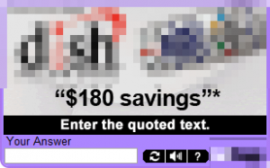
5. ADs in CAPTCHA
You know the places you need to enter some random text in a field, so the site knows you are not an internet robot?
This is where some clever advertisers are placing ADs now. It is very Banner Blindness oriented but the click-through rate really sucks.
The banner GETS shown and is read by the visitor.
But the visitor wants something else and ignores everything but the text he needs to enter.
If you find CAPTCHA AD network that pays per 1000 impressions – you can get some $0.01 per 10 (or 100) visits (or less). Otherwise – I don’t recommend this method.
6. Pop up
The most hated method, that is absolutely forbidden by Google AdSense and will get your account disabled but with the biggest click-rate. Very often there are sites that detect even pop-up and ad-blockers and don’t allow you to enter the site if you don’t disable the AD Block add-on.
Such sites are no longer tolerated by the big G after the Panda Update. Heavy AD sites get their Rank and Authority lowered.
If you are in the Blogging for long – you already know how the Panda impacted on organic traffic on most AD Heavy sites. If you are newcomer – please don’t do this. It sucks.
7. Relevant affiliate banners.
Nothing sells better than affiliated product! Nothing.
Most of the people coming to your site via Search engine know what they need. Affiliate link or banner with picture and prices is the next thing they will click. You only need good promotional article with good keywords, that will make people land on your page instead on the others. Why would anyone need to read review for latest Canon EOS camera? Because they need it and are ready to buy!
8. Any ADs that pay per impression.
You will rarely find that Advertiser breed anymore, but this is an AD type, that is absolutely the winner. You don’t need to do anything more than negotiating the place with the Advertiser. He will give you the AD code and will pay you either for the whole Year, based on your traffic, or per 1000 impressions. There are some scammers out there, that are still trying to get to your site for literally CENTS, but remember – it is your site. Research the Advertiser in the first page search results. If it is receiving good reviews – why not. Let them place an AD on your site.
You can always get them down if you are not happy with the results, or they place an AD, that is not good for your site, is offensive, is not what you negotiated, is adult or any other suspicious activity from their side.Your blog – your rules.
Anyway, this article is going to pass 1000 words, and I don’t want to bore you to death. If you have any good idea against Banner blindness, please drop me a mail or a comment. I am open to all suggestions


Sorry, the comment form is closed at this time.